What Software Might Feel Like When It Actually Pays Attention
Reflections on Figma's "What Does the Future of Software Look Like?"
Most of the software we use today still runs on a decades-old assumption: that the interface should look the same no matter what you're doing in it. Menus stay put. Panels stay put. You learn where things live, and then you go hunting for them every single time.
Figma recently rounded up a set of speculative visions from designers and researchers imagining what comes after that assumption breaks down — and reading through it, three ideas stuck with me enough that I wanted to sit with them a while longer. You can read the original piece here: figma.com/blog/future-states.
1. Controls that show up only when you need them
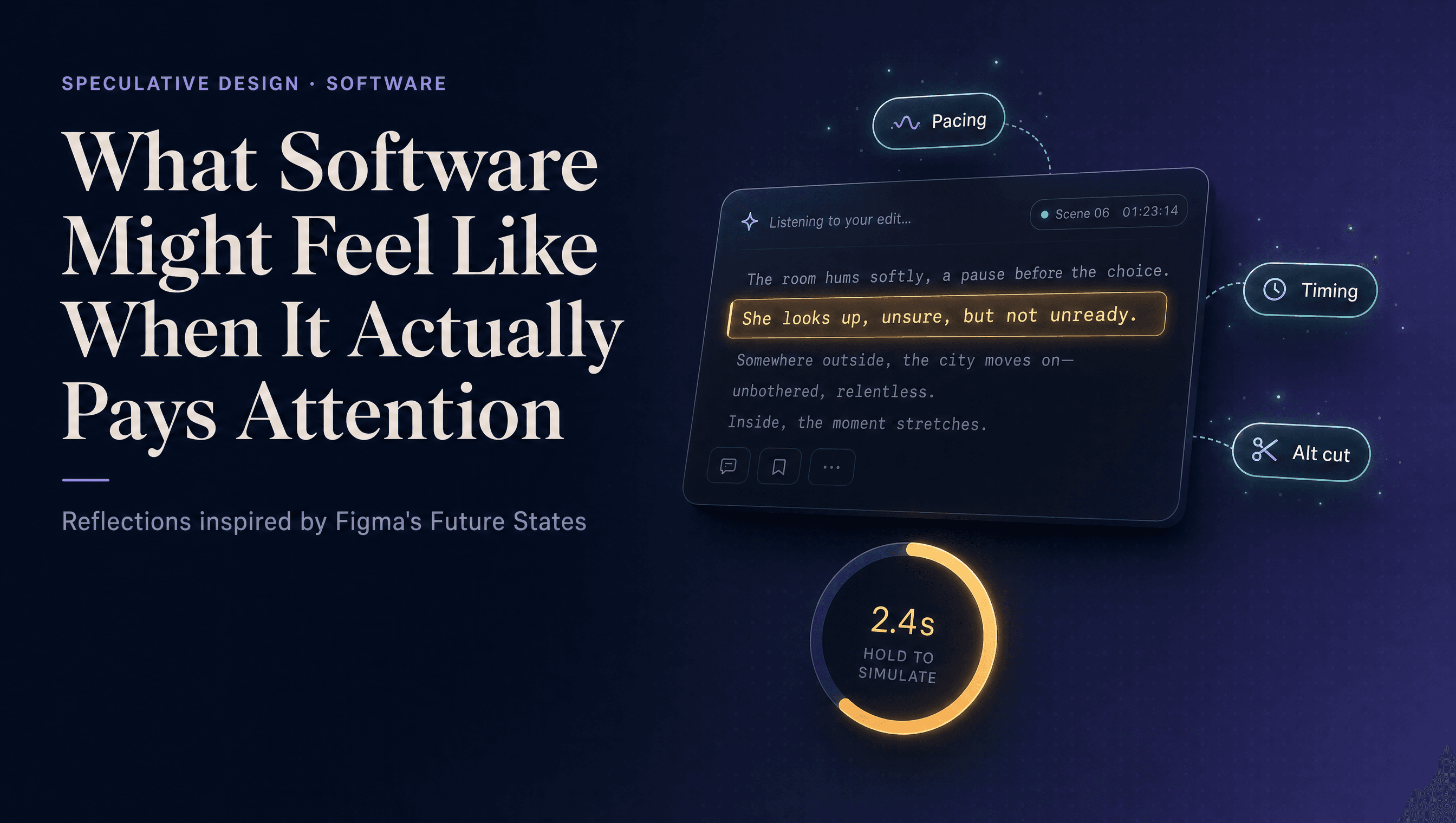
One of the more grounded ideas in the piece is deceptively simple: instead of a fixed toolbar sitting on screen at all times, the tool selects you — or rather, it responds to whatever you've selected. Click a sentence, a frame, a clip, and the relevant controls materialize around that specific thing. Finish, and they disappear again.
It's a small shift with a bigger implication. Right now, software interfaces are organized around modes — the editing mode, the export mode, the settings panel — because that's how the underlying system is structured. But that's not how people think. Creative work usually starts with intent ("make this hit harder," "slow this down," "simplify this"), and the contributors argue that tools should be organized around that intent rather than around their own internal plumbing. The example that stuck with me: someone editing a video that feels sluggish selects the clip and is offered timing, pacing, and alternate-cut options right there, instead of digging through five layers of menus to find them.
The payoff isn't really speed. It's that the conversation about the work shifts from which button did I press to what did I actually change, and why.
2. Holding something to see where it leads
The second idea is the one I keep coming back to. Instead of hitting send, buy, or check off a task and finding out the consequences later, imagine holding it down for a moment first — and watching a simulation of what happens next play out in front of you.
Hold a drafted message, and see how the conversation might unfold before it's sent. Hold a purchase, and see the pattern of how you'd probably actually use the thing. Hold a to-do item, and see what happens if it sits untouched for another month. It's a preview, not a prediction carved in stone — but it's built from your own data, not generic guesswork, which is what makes it feel less like a gimmick and more like a second opinion from the software itself.
Zoom out and this idea gets more interesting than a UI trick. Applied beyond personal choices — to money, health, policy — the same mechanic becomes a way of making higher-stakes decisions with a little more foresight than we currently get. Most software today is built to record what already happened. This is software built to let you rehearse what hasn't happened yet.
3. A surface that belongs to everyone who visits it
The last idea is more of a mood than a mechanic. Instead of a feed shaped by an algorithm, or a document locked behind your personal login, imagine a shared surface — something more like a wall than a stream — where anything you leave stays there for the next person, layered on top of whatever came before.
It's a quiet rejection of two things that define most digital spaces today: the personalization that makes every feed feel private and disposable, and the ownership model that makes every document feel like it belongs to exactly one person. A communal, timeless canvas is a different kind of default — closer to graffiti on a wall than a post in a timeline.
Why this is worth thinking about now
None of these are shipped products. They're closer to thought experiments — sketches of what interfaces could feel like if we stopped designing around the constraints of menus, logins, and static toolbars, and started designing around intent, foresight, and shared presence instead.
What I like about all three is that none of them lead with the word "AI." They lead with a genuine interface problem — clutter, hindsight, isolation — and AI shows up as the thing that makes the solution feasible, not as the headline. That's probably the more useful way to think about where software is actually headed: less "add an AI feature," more "what would this tool do if it could finally pay attention to what I'm actually trying to do."
Worth a full read if you're into this kind of speculative design work: figma.com/blog/future-states.