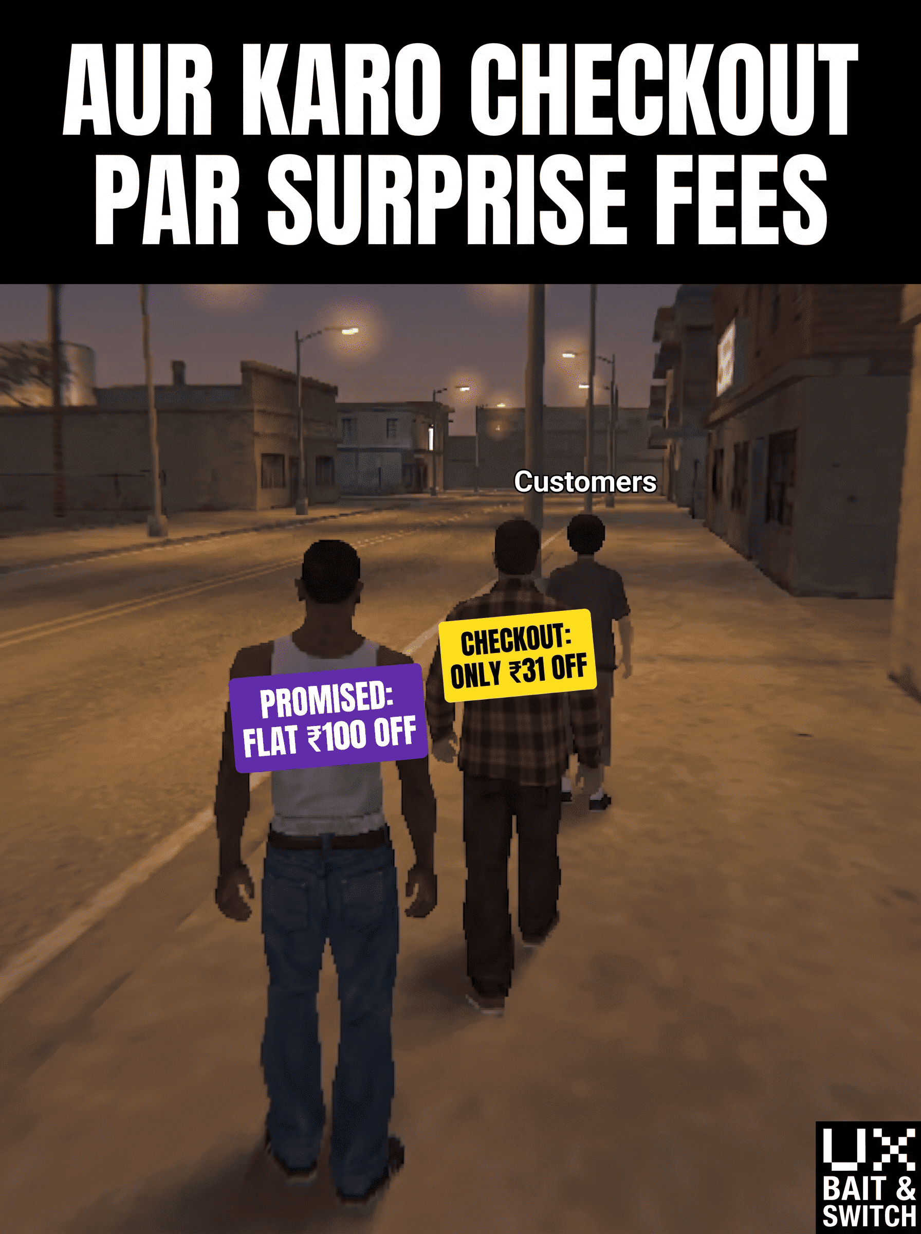
Saw a meme yesterday that nailed a UX pattern I studied recently in my certification, and it's stuck with me.
A ₹100 discount headline pulls you in. It sets a clear expectation. But by the time you hit checkout, the number on screen doesn't match the number in your head — delivery fees, "small cart" charges, platform fees, or a discount that only applies above a certain order value.
That gap between what was promised and what actually shows up at payment has a name in UX: bait-and-switch. And whether or not every business intends it that way, the effect on the user is the same — confusion at the exact moment they were about to trust you with their money.
Short-term, this might nudge conversions up. Long-term, it quietly erodes something much harder to win back: trust.
Curious what other designers think — is this a fair use of the term "bait-and-switch," or is there a better name for this specific pattern (price anchoring? drip pricing? something else)?